

 ilovegraphics
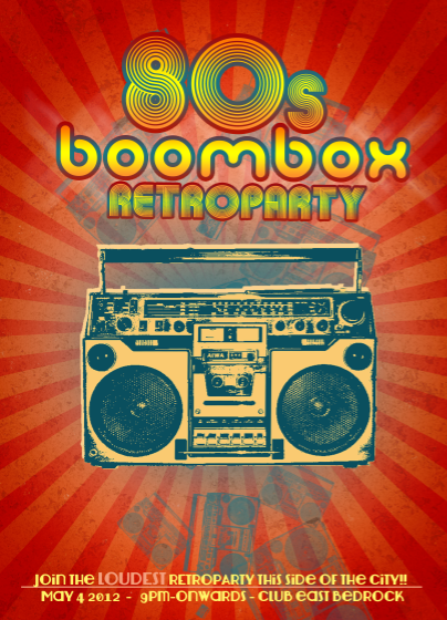
If you have an 80's themed event, you need to promote it with an equally "80’s styled" poster. This tutorial will help you accomplish just that. All you have to do is to follow these instructions and you will learn how to add the right effects and filters for that convincingly 80’s kind of style.
 ilovegraphics
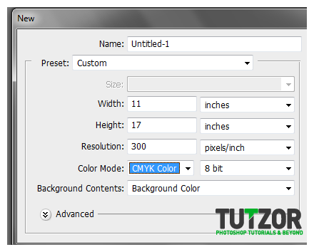 ilovegraphics
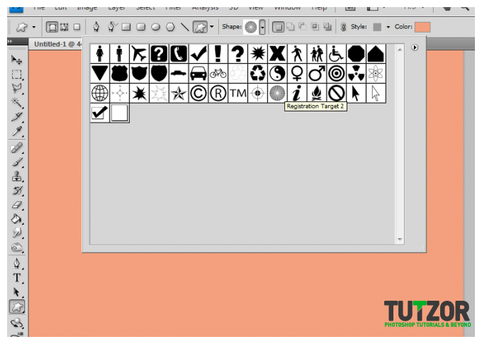 ilovegraphics
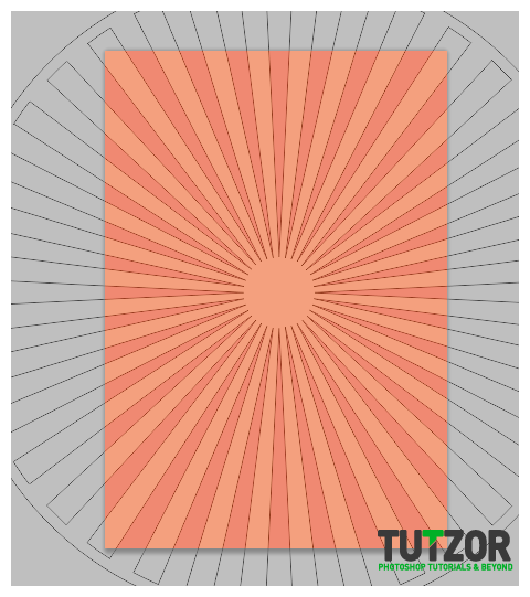 ilovegraphics
 ilovegraphics
 ilovegraphics
 ilovegraphics
 ilovegraphics
 ilovegraphics
 ilovegraphics
 ilovegraphics
 ilovegraphics
 ilovegraphics
 ilovegraphics
 ilovegraphics
 ilovegraphics
 ilovegraphics
 ilovegraphics
 ilovegraphics
 ilovegraphics
 ilovegraphics
 ilovegraphics
 ilovegraphics
 ilovegraphics
 ilovegraphics
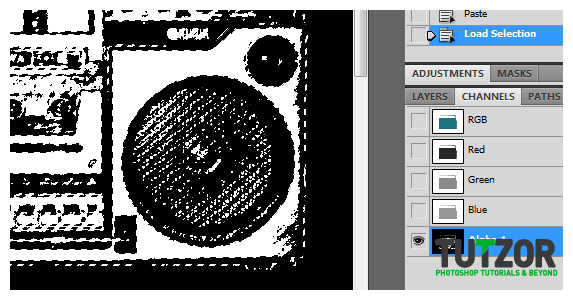
Copyright© 2012 Tutzor All Rights Reserved | Developed by: Iceous Design

