 irenethompson80
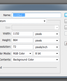
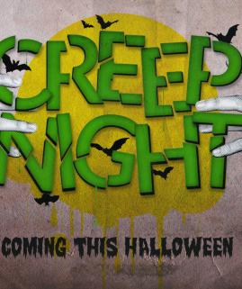
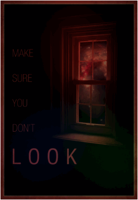
We will show you how you can use subtle color and blending styles to create a more dramatic and minimalistic poster style. CMYK color mode is also needed if this is for a four color printing process. You may also apply this design style to flyers, simply adjust the dimensions and you’re good to go.
 irenethompson80
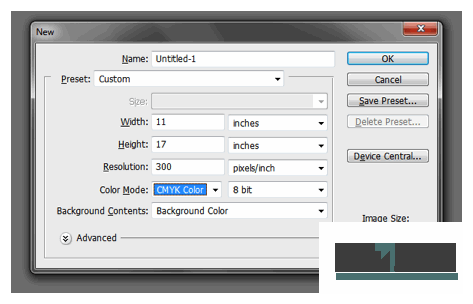 irenethompson80
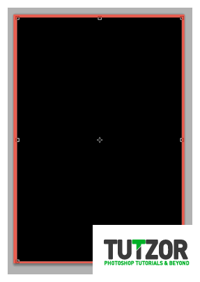 irenethompson80
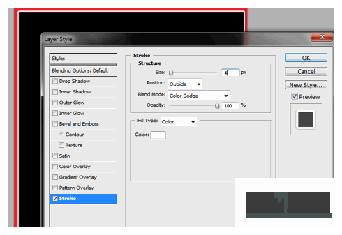 irenethompson80
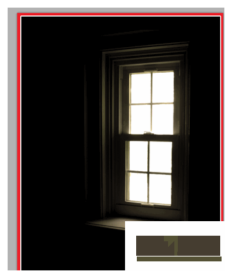 irenethompson80
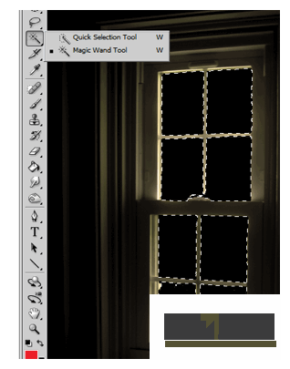 irenethompson80
 irenethompson80
 irenethompson80
 irenethompson80
 irenethompson80
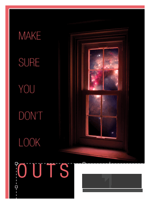 irenethompson80
 irenethompson80
 irenethompson80
 irenethompson80
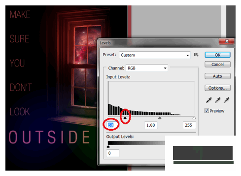 irenethompson80
 irenethompson80
 irenethompson80
 irenethompson80
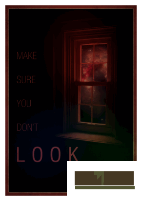
Copyright© 2012 Tutzor All Rights Reserved | Developed by: Iceous Design