 Seiorai
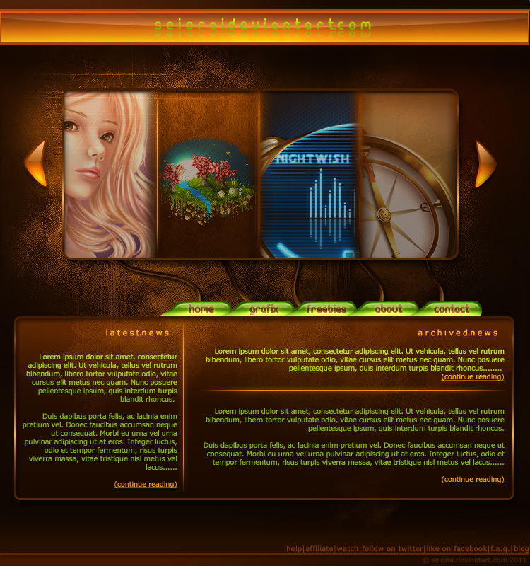
Today it's time for opposites collision folks <3
Grunge+Glossy, the eternal battle! xD
Nice ay? Here's what we'll get in the end, after numerous weeks of hard labour through hot steam and all that:
---please read page 1 of the tutorial first!
 Seiorai
 Seiorai
 Seiorai
 Seiorai
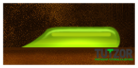 Seiorai
 Seiorai
 Seiorai
 Seiorai
 Seiorai
 Seiorai

 Seiorai
 Seiorai
 Seiorai
 Seiorai

 Seiorai
 Seiorai

 Seiorai

 Seiorai
 Seiorai


 Seiorai
 Seiorai
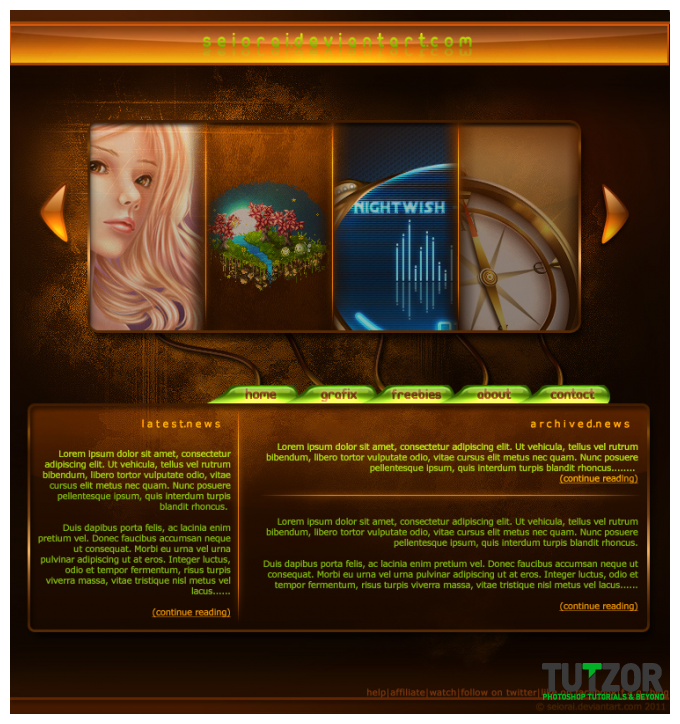
Copyright© 2012 Tutzor All Rights Reserved | Developed by: Iceous Design