

 ilovegraphics
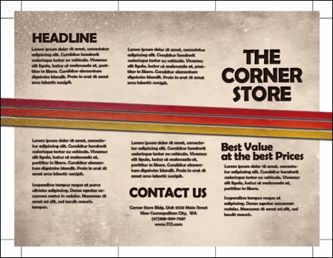
It is easy to design brochures using Adobe Photoshop but designing a great layout that is already print ready requires some specific additional setups. In this tutorial, we will go through the process of setting up and designing a brochure that’s ready for printing.
 ilovegraphics
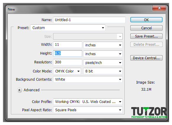 ilovegraphics
 ilovegraphics
 ilovegraphics
 ilovegraphics
 ilovegraphics
 ilovegraphics
 ilovegraphics
 ilovegraphics
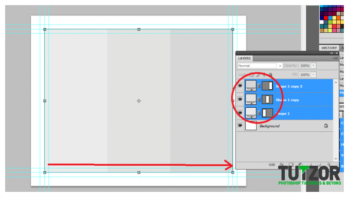 ilovegraphics
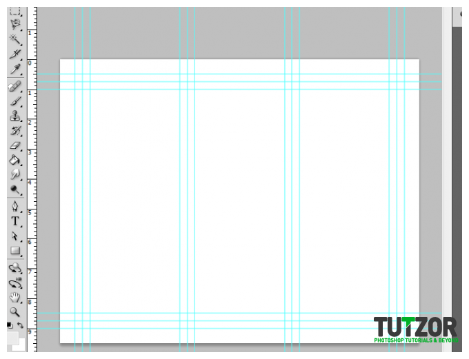 ilovegraphics
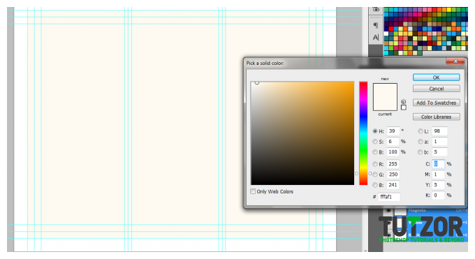 ilovegraphics
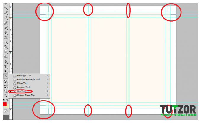 ilovegraphics
 ilovegraphics
 ilovegraphics
 ilovegraphics
 ilovegraphics
 ilovegraphics
 ilovegraphics
 ilovegraphics
 ilovegraphics
 ilovegraphics
 ilovegraphics
 ilovegraphics
 ilovegraphics
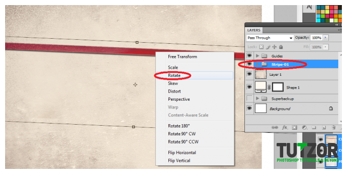
Copyright© 2012 Tutzor All Rights Reserved | Developed by: Iceous Design


