How to design your own folder icons
26
Sep'10
Member since:
Sep 2010
Step
01
Member since:
Sep 2010
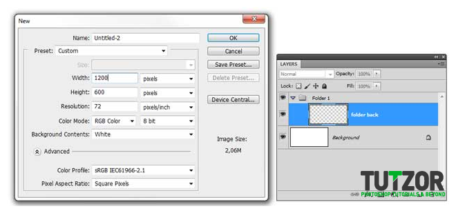
Create a new document (1200x600 px). Add a new group and call it “folder 1” and a layer called “folder back”.
Step
02
Member since:
Sep 2010
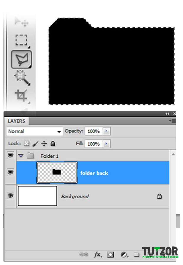
Using the polygonal lasso tool make a selection like me and fill it with black (Hold shift for straight lines).You can deselect (CTRL+D) and place the folder in the center of the canvas.
Step
03
Member since:
Sep 2010
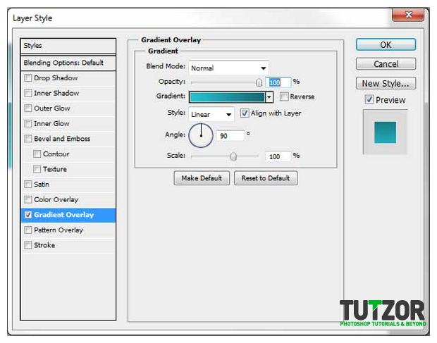
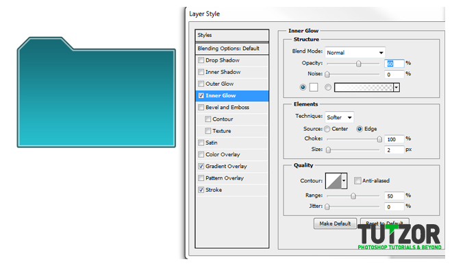
Go to layer style (double click on the layer) and check the gradient overlay box and set this settings: Linear gradient from #00baca to #005d68, angle 90 scale 100%.
Step
04
Member since:
Sep 2010
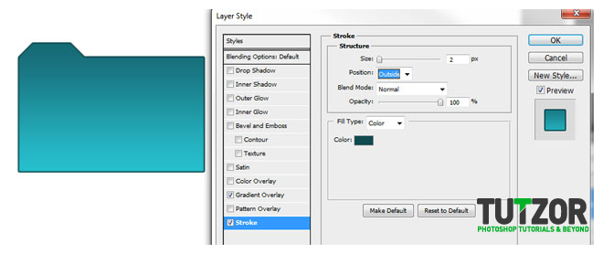
In the same layer style panel select stroke and set this settings: Size 2 px Position outside, Blend mode normal, Color #003b40.
Step
05
Member since:
Sep 2010
In the same panel check the inner glow box and set this settings: Color white (#ffffff), Blend mode normal, Opacity 60%, Choke 100%, size 2px, your result should look like mine.
Step
06
Member since:
Sep 2010
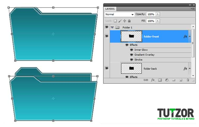
Duplicate this layer and call it “folder front”, leave it on top. Now hit CTRL+T and right click on the selection and choose perspective from the dropdown menu, then drag the top left point to the left. Right click again on the selection and choose scale and drag the middle top point down a bit, so this will look like an open folder. Set the layer opacity to 60%.
Step
07
Member since:
Sep 2010
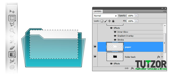
Add a new layer between the 2 layers and call it “paper”. Using rectangular marquee tool make a selection like me and fill it with a gradient from light grey to white, as I did.
Step
08
Member since:
Sep 2010
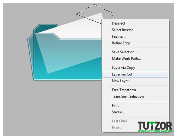
Let’s rotate the paper a bit (CTRL+ T), then make a selection with the polygonal lasso tool over the top corner of the paper, right click > layer via cut. (note: change the color of the background a bit just to observe the paper better.)
Step
09
Member since:
Sep 2010
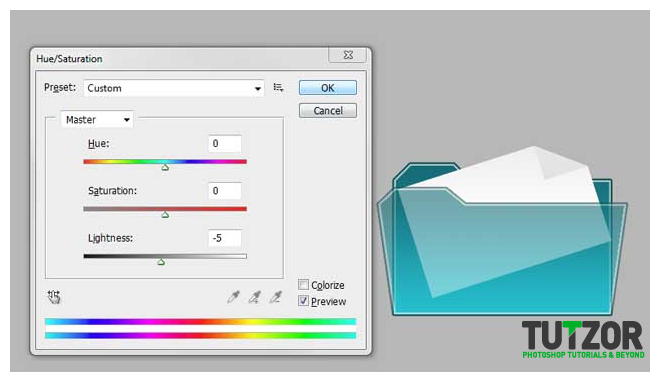
Hit CTRL+ U (Hue/Saturation) for the layer you just cut and move the lightness to -5. Now hit CTRL + T for transform, and flip the corner horizontal and vertical(right click on the selection and you will see there the 2 options)Place the corner of the paper like I did and merge the 2 layers together (select the 2 layers, paper and the corner, > right click > merge layers). Rename the layer “paper”
Step
10
Member since:
Sep 2010
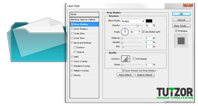
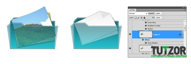
Double click the “paper” layer for styles and select drop shadow. Set the angle to 90 Distance 0, spread 0, size 5. Your result should look like mine. (You can change the background color back to white)
Step
11
Member since:
Sep 2010
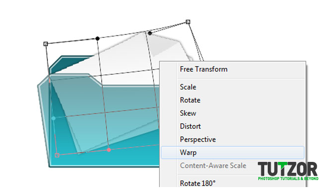
Duplicate the “paper” and rotate it a bit (CTRL+T > Rotate), and move it a little up like me. Then play with warp, (CTRL + T > Warp). Pull the top corner a bit up as I did.
Step
12
Member since:
Sep 2010
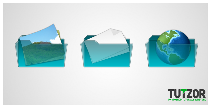
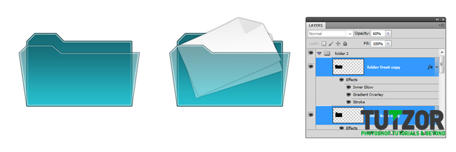
Add a new group “folder 2” and duplicate the layers from “folder 1” group except the “papers” and move the layers to the left.
Step
13
Member since:
Sep 2010
I’m sure you’re going to like this. Open 2 images with you or what images you want an paste them in our document. Scale them down, rotate them, like you did with the “papers”. You can add drop shadow and you can “play” with warp. Look at my result.
Step
14
Member since:
Sep 2010
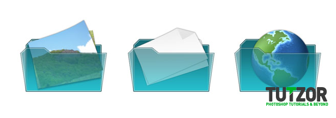
Duplicate the folder again in a new group “folder 3”. Open the “earth” image and make a selection around it with the elliptical marquee tool and paste it into our document. Scale it down and add some drop shadow.
Step
15
Member since:
Sep 2010
Go to the background layer and add a nice radial gradient from light grey to white, just for a better look of the icons. Now you’re done with another set of icons, you can explore some more.
