

 irenethompson80
In this tutorial, we will teach you a couple of tricks that should be easily integrated into your own retro styled abstract poster art. You may also integrate these effects when designing flyers or catalogs for print.
irenethompson80 irenethompson80
 irenethompson80
 irenethompson80
 irenethompson80
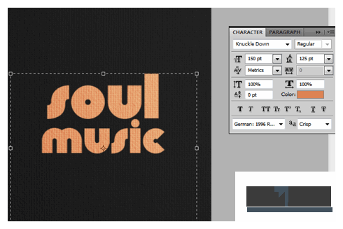 irenethompson80
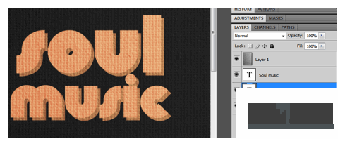 irenethompson80
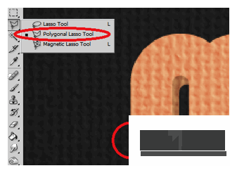 irenethompson80
 irenethompson80
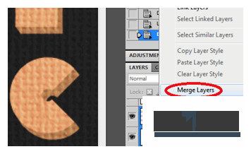 irenethompson80
 irenethompson80
 irenethompson80
 irenethompson80
 irenethompson80
 irenethompson80
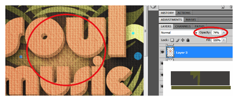 irenethompson80
 irenethompson80
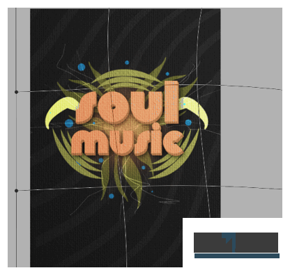 irenethompson80
 irenethompson80
Copyright© 2012 Tutzor All Rights Reserved | Developed by: Iceous Design
